Posted by admin Dec - 31 - 2019 Comments Off on Simply deceptive

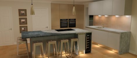
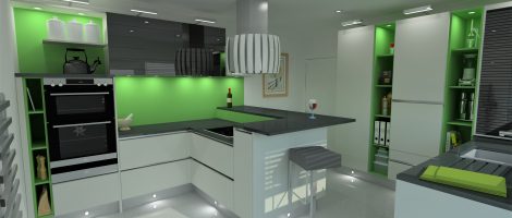
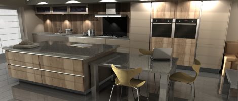
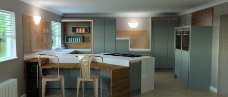
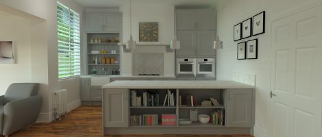
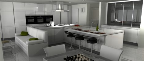
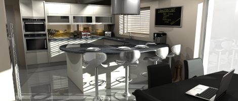
A lot of designs are more complicated than they look. This one relies on push-to-open fridge and freezer. That’s not why I’ve included it here, and nor is the colour scheme (although I do like the metal accents). It’s the shaped colour change in the island worktop, which sometimes I’ll use to account for a Read More …
Posted by admin Dec - 30 - 2019 Comments Off on Make it bigger

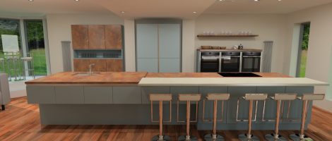
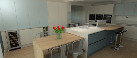
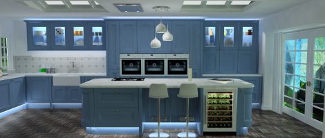
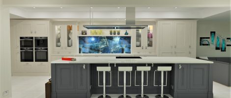
Part of the idea here was to defy symmetry. Floating effects are also an important ingredient: no horizontal fillers, height changes and inserts, and the suspended island extension. Varying worktop thicknesses is one of the ways I’ll sometimes deal with worktop joins in very large islands. Rendered in ArtiCAD.
Posted by admin Dec - 30 - 2019 Comments Off on Bedrooms

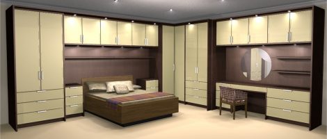
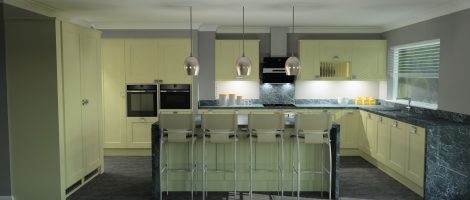
I don’t know what’s happened to fitted bedrooms. They were a significant part of MFI’s mass-market business, but when MFI went away, while others – especially the German brands – took up the slack in kitchens, nobody seems to have done the same for bedrooms. It’s taken for granted that kitchens will be fitted, but Read More …
Posted by admin Dec - 30 - 2019 Comments Off on Into the woods

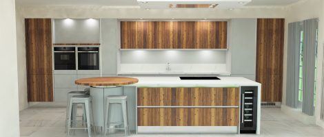
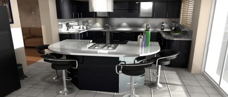
The wooden door I’ve used here is a thick, textured veneer, like chunks of bark: not much fun to clean, but unending pleasure to look at. Rendered in ArtiCAD.
Posted by admin Dec - 30 - 2019 Comments Off on Sugar cube

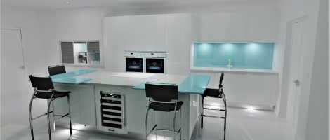
“Sugar cube” is what a friend of mine likes to call all-white kitchens, whereas I prefer to think of them in terms of ice. Perhaps that says something about each of us. The breakfast bars, about as thin as you can get, are glass. Rendered in ArtiCAD.
Posted by admin Dec - 30 - 2019 Comments Off on Pop art

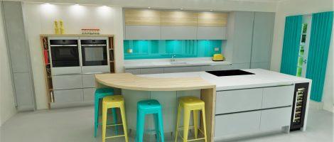
Accessories make a huge difference. The underlying design has its inspired parts, though. The island is one of my favourites. Rendered in ArtiCAD.
Posted by admin Dec - 30 - 2019 Comments Off on Finest kind

This complex design has too many parts to capture in one render, but this has the spirit. There are several different handleless solutions in view, and the blade-thin worktops are Dekton sintered stone, which is nearly indestructible. The beautiful render is in ArtiCAD.
Posted by admin Dec - 30 - 2019 Comments Off on Now and then

This was interesting. I wanted to include one of my favourite renders in the slideshow on this site, but its proportions didn’t fit well: its perspective was pretty forced already, and stretching it made it – I felt – uncomfortable. The original was in 2020 (the software, not the year), to which I don’t have Read More …
Posted by admin Jun - 13 - 2019 Comments Off on All about the feels

Some kitchens exist in isolation. But much of the pleasure in designing others comes from finding ways to integrate them into, and have them respond to, their settings. This one picks up on, and contributes to, a wood-rich modernity, a bit of Scandinavia in a Kentish village. I know: how pretentious does that sound? Rendered Read More …
Posted by admin May - 31 - 2019 Comments Off on Austrian warmth

Although rendered in 2020, I think this is an older Intuo design, which I reproduced for practice with the new software. There are little details I like – even the judicious use of vertical profiles, which I couldn’t do for a few years while I had access only to UK mass-market versions -, but, overall, Read More …
Posted by admin Apr - 23 - 2019 Comments Off on If it ain’t broke…

The idea here was to break every line: to make everything surprising. I don’t often get the chance. I could look at this all day… Rendered in ArtiCAD.
Posted by admin Apr - 3 - 2019 Comments Off on Don’t worry about the wall units

Okay, there’s not a lot of kitchen in this one – but there would be less if I couldn’t specify bespoke spice rack, shelves, and even cabinet sizes. This image is partly a tribute to the design software, though. Without the astonishing technology available to us – and the continuing effort to make it even Read More …
Posted by admin Feb - 28 - 2019 Comments Off on It might not look complicated…

There’s hardly ever just one way to design a room. In this one, not returning along the end wall was the key to this particular solution. All the appliances and utilities are fitted into and on either side of the chimney-breast, leaving room for a substantial peninsula with nothing but clear worktop, deep drawers, and Read More …
Posted by admin Feb - 27 - 2019 Comments Off on Frozen

Colour and light, and a little invention, help keep traditional styles alive – or give life back to them. One of my tricks (this week, anyway) is to confound expectations around oven towers. At first glance, the doors over the ovens don’t make sense – unless you’re designing not as a row of cabinets, but Read More …
Posted by admin Jan - 17 - 2019 Comments Off on Evolution

I’m convinced that we’re seeing an evolution in kitchen design, with European influences combining with extraction technology better suited to our climate… It’s not just the rise of open-plan. It’s also the way that European approaches to space are being adapted to our tastes and to the shapes of our homes. We wouldn’t have designed Read More …
Posted by admin Jan - 4 - 2019 Comments Off on It’s full of stars!

I love black kitchens, and I love proving that they don’t have to be heavy. I’ve designed this curved island a few times, too, but this is the smallest. Hygena (Homebase’s version of the brand), rendered in 2020 v10.
Posted by admin Dec - 20 - 2018 Comments Off on White on white (on white, on white…)

Some designs don’t even feel like work. This one just seemed made for a handful of things I liked: a substantial breakfast area behind dark-glass tambours, a 1200mm island depth with further overhang, an array of hobs, a bank of tall units with a subtle breakfront to accommodate the wall depth at either end, an Read More …
Posted by admin Sep - 23 - 2018 Comments Off on Worth waiting for

1909 was launched at a time when I had access only to German kitchens. Germans don’t tend to do the UK’s kind of traditional very well, and I love both. I had to wait a few years to design my first 1909 kitchen, and this was it. The shape of the room forces the island Read More …
Posted by admin Sep - 19 - 2018 Comments Off on Going up (and up)

This was one of my first designs using 2020 v10, which was a leap upward for the software. The house was on a hillside, going down (or up) it in a series of levels, and I repeated that in the design of the kitchen, which steps down from wall units to mid-height ovens to peninsula Read More …
Posted by admin Sep - 14 - 2018 Comments Off on Brown is beautiful

This one’s for anyone who says there’s nothing new in kitchens: a true-handleless, routered Shaker, looking sharp and cool as you like in cutting-edge brown. The base-units colour almost merges into the Sapele flooring, the wall units into the matching wall paint. The worktop is Dekton: thin as a blade, and nearly indestructible. Rendered in Read More …
Posted by admin Sep - 9 - 2018 Comments Off on Secret thoughts

This may always be my favourite of my Nobilia (Odina) kitchens. It looks great, and matt-lacquered doors and matt-glass splashbacks were novel at the time; but, underneath all that, I got to play some games. There’s a grid, only apparent at the right angle, a bit like a Rubik’s cube coming together. Separately, the whole Read More …
Posted by admin Jun - 23 - 2018 Comments Off on Hard times

This one has a hard-edged feel, to me – ironically, because here’s that curve again. The glass splashback is mirrored gold or brass, the worktop Corian, the kitchen I think Schreiber. Schreiber (probably) rendered in 2020 v10.
Posted by admin Jun - 21 - 2018 Comments Off on Anything else?

Some clients will have every detail of how they’ll use the room worked out. That’s partly why this design has something of the look of a professional kitchen, with every element task-specific. I took this utilitarianism even into eschewing clad-on décor ends, a look I like anyway, when it’s right. Plus, I like the colours. Read More …
Posted by admin Apr - 17 - 2018 Comments Off on It’s all kitchens, really

In some of my favourite designs, architecture and kitchen work together. In this one, for instance, neither would make any sense without the other. There are things I’d do differently today: I’d use a C-profile with the J on the tall units, or push-to-open, and I’m not keen on a pelmet or an undershelf with Read More …
Posted by admin Mar - 22 - 2018 Comments Off on You know you want to

A lot of people still shy away from colour: they’d like to go there, but they’re not sure they’re brave enough. But colour doesn’t have to be overwhelming, and it’s one of the easiest ways to wow. Nobilia (Odina) rendered in 2020 v10.
Posted by admin Feb - 16 - 2018 Comments Off on What’s black and white and red all over?

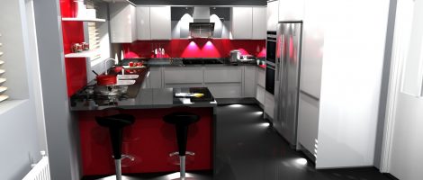
I do enjoy using the same material in different ways. Here, it’s the red glass. Glass under a bar peninsula. I must do that again… Nobilia (Odina) rendered in 2020 v10.
Posted by admin Jan - 15 - 2018 Comments Off on Nobody here but us kitchens

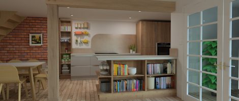
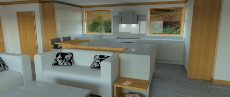
Set in a large open space, this kitchen blends with the décor to such an extent that it’s nearly invisible. It helps that I have access these days to such a range of materials and can make non-kitchen elements using them, so that the sofa surround and the coffee table become parts of the kitchen, Read More …
